
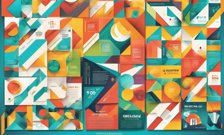
In the world of design, a poster is not just a piece of paper with images and text; it is a powerful medium that communicates messages, evokes emotions, and captures attention. The art of poster design is deeply rooted in the psychology of visual perception, understanding how brains interpret and respond to visual stimuli. In this blog, we’ll delve into the fascinating realm of visual perception and explore how it influences the creation of compelling posters.
Understanding Visual Perception
The Role of Gestalt Principles
When we look at an image or a design, brains naturally seek order and meaning. This is where Gestalt principles come into play. The mind tends to perceive elements as a whole rather than individual parts. These principles include proximity, similarity, continuity, closure, and figure-ground relationships. Poster designers leverage these principles to guide the viewer’s perception and also, create your own poster that is a cohesive and harmonious visual experience.
Color Psychology in Poster Design
Emotional Impact of Colors
Colors have a profound impact on emotions and behaviors. Warm colors like red and orange can evoke feelings of energy and excitement, while cool colors like blue and green may create a sense of calm and serenity. Successful poster design involves a strategic selection of colors to convey the intended message and elicit specific emotional responses from the audience.
Typography and Readability
The Art of Choosing Fonts
The fonts used in a poster are more than just words; they are visual elements that contribute to the overall design. The choice of fonts can convey the tone and personality of the message. Bold, sans-serif fonts may suggest a modern and dynamic feel, while elegant serif fonts can evoke a sense of tradition and sophistication. However, it’s crucial to strike a balance between creativity and readability to ensure that the message is effectively communicated.
Composition Techniques for Impactful Posters
The Rule of Thirds
One of the fundamental principles in visual design is the rule of thirds. Imagine dividing your poster into a 3×3 grid, both vertically and horizontally. The points where these lines intersect are strategic focal points. Placing key elements like images or text along these lines or at the intersections can create a visually pleasing and balanced composition, guiding the viewer’s eyes through the design.
The Role of Symmetry and Asymmetry
Balancing Act
Symmetry and asymmetry play distinct roles in poster design. Symmetrical balance imparts a sense of order and stability, while asymmetry can add energy and dynamism. Understanding when to use each technique is crucial for achieving the desired visual impact. A symmetrical composition might be suitable for a formal event poster, while an asymmetrical layout could enhance the visual interest of a concert poster.
Visual Hierarchy in Poster Design
Directing the Viewer’s Gaze
Establishing a visual hierarchy is essential in guiding the viewer’s gaze through the poster. This involves arranging elements in a way that prioritizes their importance. The headline, for example, should stand out as a focal point, followed by subheadings and supporting visuals. Strategic use of size, color, and placement ensures that the audience absorbs information in a logical and engaging sequence.
The Impact of Cognitive Load
Simplifying Complexity
Cognitive load refers to the amount of mental effort required to process information. In a world inundated with stimuli, simplicity is a key factor in effective poster design. A cluttered and complex poster can overwhelm the viewer, making it difficult to absorb the intended message. By simplifying the design and focusing on essential elements, designers can reduce cognitive load and enhance the overall effectiveness of the poster.
The Science of Eye Movement
Guiding the Eyes with Flow
Understanding the natural movement of the human eye is crucial for creating posters that capture and maintain attention. Eye movement tends to follow certain patterns, such as the F-pattern or the Z-pattern. By aligning key elements along these paths, designers can ensure that the viewer’s gaze naturally flows through the poster, increasing the likelihood of message retention.
The Importance of Contrast
Making Elements Stand Out
Contrast is a powerful tool in poster design. Whether it’s contrasting colors, fonts, or sizes, creating distinctions between elements helps direct attention and highlight key information. High contrast can be particularly effective in emphasizing a call to action or a central message. However, it’s essential to strike a balance to avoid overwhelming the viewer.
Leveraging contrast is a paramount aspect of effective poster design. The strategic use of varying colors, fonts, and sizes guides attention, emphasizing crucial details. This technique, especially with high contrast, proves impactful in highlighting calls to action or central messages. Nevertheless, maintaining a harmonious balance is imperative to prevent overwhelming the viewer’s experience.
The Psychology of Cultural Symbols
Harnessing Symbolic Meaning
Cultural symbols carry inherent meanings and associations that can deeply influence perception. Designers must be mindful of the cultural context in which a poster will be viewed. Symbols, colors, and imagery that hold specific cultural significance can either enhance or detract from the effectiveness of the design. It’s crucial to conduct thorough research to ensure that the chosen elements resonate positively with the target audience.
Unveiling the Psychology of Cultural Symbols requires an exploration of collective consciousness. Cultural contexts shape the narrative, guiding designers to create resonant visuals. Thorough research becomes a compass, steering away from unintended misinterpretations. A poster, when immersed in this cultural understanding, transforms into a powerful communicator, bridging gaps and fostering meaningful connections.
Conclusion: Crafting Memorable Visual Experiences
In the realm of poster design, every element is a brushstroke contributing to a larger canvas of visual communication. By understanding the psychology of visual perception, designers can create posters that not only capture attention but also leave a lasting impression on the viewer’s mind. From the strategic use of colors and fonts to the thoughtful arrangement of elements, each decision shapes the overall impact of the poster.
So, whether you’re designing a poster for an event, a product, or a cause, remember the power that lies in the psychology of visual perception. By adhering to principles of design and considering the cognitive processes at play, you can craft posters that not only look aesthetically pleasing but also effectively convey your message to the world.